Identifying tweets by location & country
05 June, 2016 by Tom
Social Bearing have recently launched our Geochart feature which displays a snapshot of tweet activity broken down by estimated country of origin. Countries displayed on the chart are calculated based on the location specified in the user’s profile. The Geochart works like a heatmap, with countries highlighted at different strengths based on the number of tweets from that country.
Currently, only around 1% of all tweets are accurately Geotagged with longitude and latitude coordinates which indicate a specific location for the tweet. The problem with using Geotagged tweets is that thousands of tweets would need to be loaded just to get a handful of geolocated tweets. This means it is hard to get an overall sense of geo based demographics for a specific search term or hashtag.
User locations however are much more likely to be defined. From the testing we’ve done, 65% of users on average have specified a location in their Twitter profile. The location however is a free text field where users can enter anything they choose. This makes it hard to extract the correct location automatically so we have used the Google Maps Geocoding API which attempts to return the most likely location from any address with a high degree of accuracy.
The Social Bearing Geochart can help with insights into all sorts of searches. As a brief example, Cricket and F1are two sports very popular in different countries; cricket is very popular in the UK, India, Pakistan and Australia for example whereas f1 has a more global appeal. The below Geocharts reflect this popularity, with tweets for ‘#f1’ originating from many countries across Europe, South America, America and South East Asia.
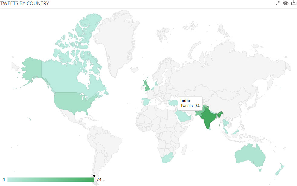
A Geochart heatmap showing hundreds of tweets for ‘#cricket’
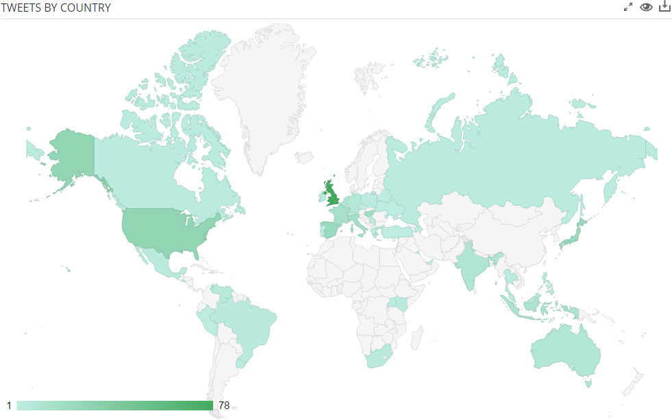
A Geochart heatmap showing hundreds of tweets for ‘#F1’
Limitations
It’s important to note the following limitations when using Geochart data for researching Twitter behavoiur
1. Tweet locations different from locations set in profiles
One of the most obvious limitations is that people can be tweeting from anywhere in the world and the profile location is not necessarily a reliable indication of the origin of a specific tweet. For a large sample of tweets however, most tweets are likely to come from the country defined by the tweeting user’s profile location. It’s usually the place which people identify themselves with; where they currently live or spend most of their time.
2. Locations not resolved
As users can have anything in their profile location, people will sometimes choose to enter thoughtful or humorous locations such as ‘the dark side of the moon’ or ‘on Twitter’ which can’t be resolved to a country. Our tests indicate around 30% defined locations cannot be resolved.
3. Locations resolved incorrectly
Sometimes a location is incorrectly resolved by Google Maps Geocoding. For example multiple towns with the same name in different countries. Fictional place names are sometimes used in profiles; e.g. ‘Hogwarts’ resolves to a location in Japan. Whilst we manually override some locations, it’s unfeasible to manually check tens of thousands.
4. Varying results for different languages
Any search in English will no doubt favour countries where English is more widely spoken. For global searches, you may want to compose a single search with keyword translations in multiple languages using the ‘OR’ operator. Check out the advanced search for more info on this.
5. Varying results at different times
You will likely see a varying heat map at different times of day depending which countries are more awake. For fairer results, loading in tweets from a full 24 hour period, which may require tweaking search terms, will produce a more reflective Geochart depending on the query.
6. Twitter usage and population densities skew results
On many Geocharts, you’ll notice the US will often have a large share of the results, even for tweets you might expect to largely originate from elsewhere. This is due to the USA has one of the highest population densities in the world along with a whopping 62% of Twitter users. It’s worth bearing in mind relative population densities and Twitter usage when researching tweets by country, even if the Geochart is reflective of tweet & user demographics.
Leave a Reply